UDS Comparison Dashboard
This dashboard allows users to compare a UDS Snapshot, from a particular point in time, with the current, year-to-date UDS numbers. It’s used to spot data issues and outliers; support strategic planning; and highlight changes in patient demographics, payer mix, and quality performance.
Add the UDS Comparison Dashboard
Navigate to Reports > Dashboards, then choose New Dashboard > UDS Comparison Dashboard
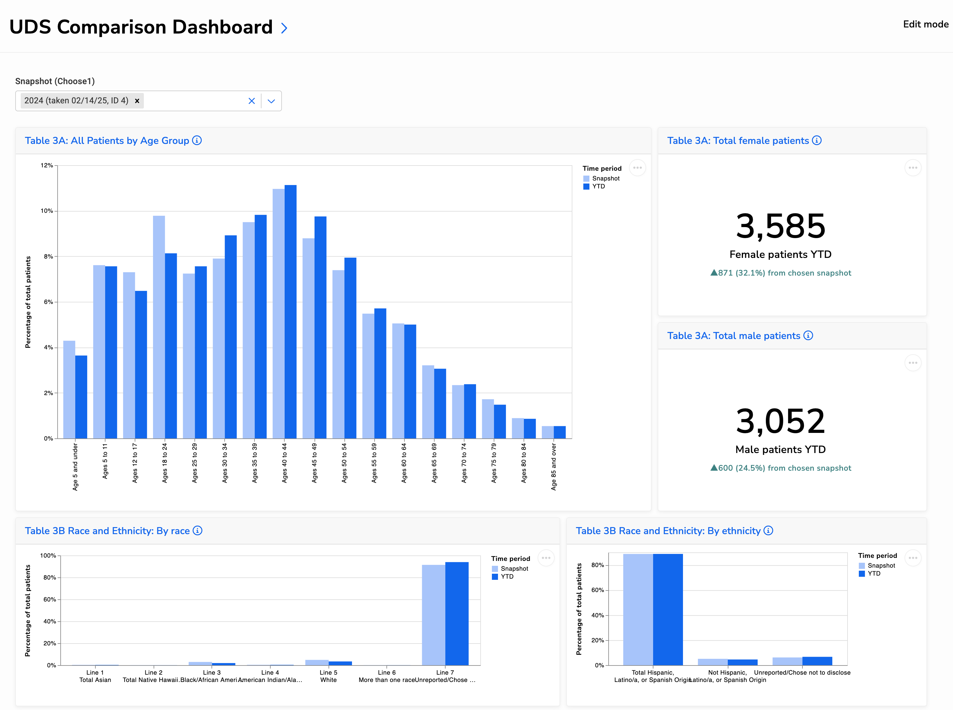
Below is a portion of the dashboard, showing UDS Tables 3A and 3B. For a larger view of the entire dashboard, open this image, then zoom in.
Understanding the Visuals
Table 3A: Patients by Age Group and Sex
These charts show patient distribution by age and sex from UDS Table 3A. Use them to:
- Spot shifts in age distribution that may reflect seasonal patterns or population changes
- Monitor growth by gender to support staffing, outreach, or program planning
- Identify unexpected changes that may warrant a data review
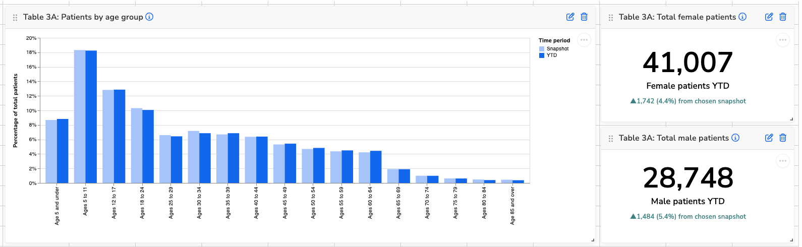
Table 3B: Patients by Race and Ethnicity
These charts show the racial and ethnic makeup of your patient population. Use them to:
- Track demographic changes over time
- Review completeness of demographic data, especially if “Unreported” is increasing
- Support equity efforts and assess alignment with your service area
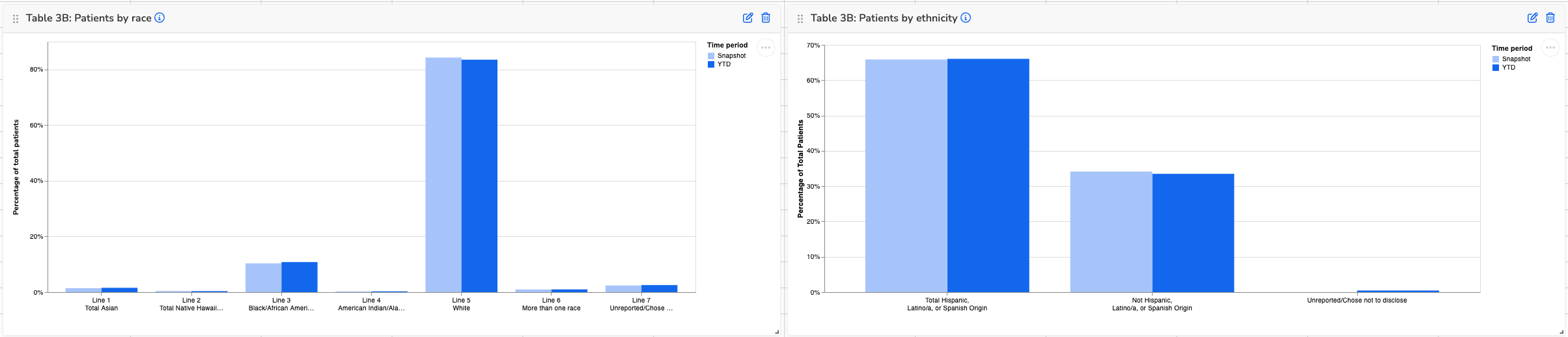
Table 4: Poverty Levels
This chart displays the percentage of patients by federal poverty level, based on reported income and family size. Use it to:
- Understand changes in income distribution over time
- Monitor the proportion of patients below 100% FPL
- Flag increases in “Unknown” that could indicate data collection issues
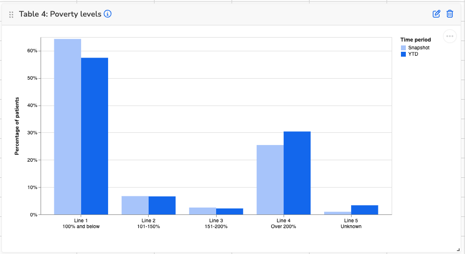
Table 4: Primary Third-Party Medical Insurance
This chart shows the percentage of patients by primary medical insurance type, comparing snapshot and YTD data. Use it to:
- Monitor shifts in insurance coverage, such as increases in private insurance or decreases in Medicaid
- Track uninsured rates and assess outreach or enrollment support efforts
- Identify data issues if totals look unexpectedly skewed or inconsistent with payer trends
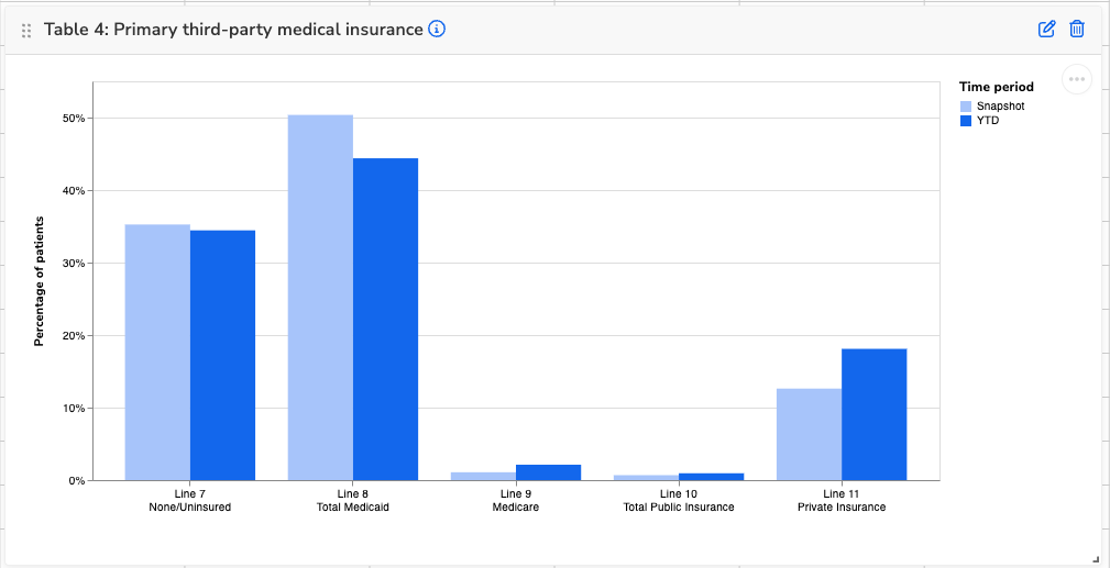
Table 4: Agricultural Workers
These visuals show the total number of patients identified as agricultural workers and the breakdown by type. Use them to:
- Track changes in your agricultural worker population over time
- Understand the balance of migratory vs. seasonal workers to support targeted outreach or services
- Spot data quality issues—entries under “Invalid agricultural data” may need to be reviewed
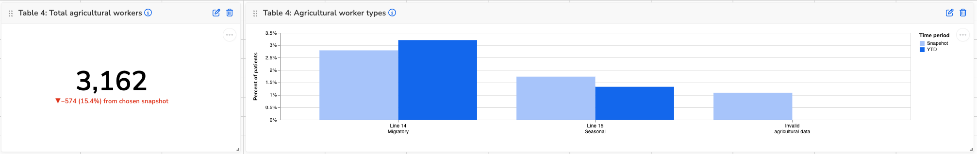
Table 4: Homelessness Cases
These visuals show the total number of patients experiencing homelessness and a breakdown by housing situation. Use them to:
- Track changes in homelessness over time.
- Understand the types of housing situations patients are experiencing to guide services or referrals
- Review data quality—entries under “Unknown” or “Invalid” may suggest gaps in screening or documentation
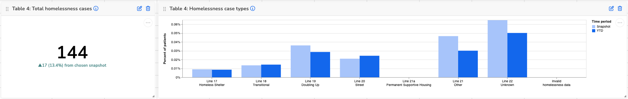
Table 5: Patients, Visits, and Visit Trends
These visuals show total patients, visits, and visit patterns by service type. Use them to:
- Track overall growth in patients and visits
- See which services are driving visit increases or decreases
- Monitor visits per patient for shifts in utilization patterns
- Spot areas that may need scheduling, staffing, or access adjustments
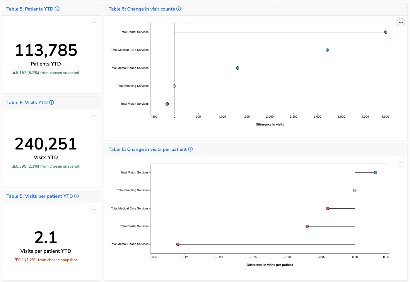
Table 6A: Diagnoses and Services
These visuals show changes in visit counts by diagnosis or service category. Use them to:
- Track significant shifts in service utilization based on your selected threshold
- Identify newly emerging needs or services that have been introduced or more consistently documented
- Support planning, staffing, or follow-up analysis around coding and service delivery
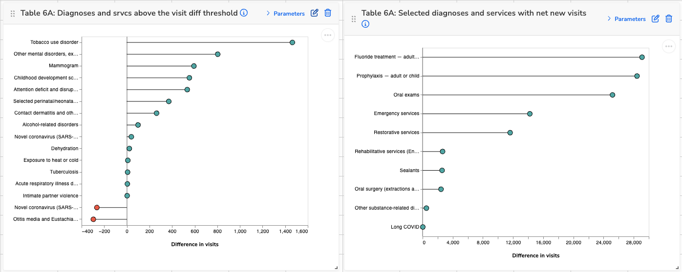
Table 6B: Prenatal Care
These visuals show data related to prenatal care patients and early entry into care. Use them to:
- Track total prenatal volume over time
- Monitor how early patients are entering care, which can support efforts to improve maternal health outcomes
- Identify shifts in documentation or access that may affect care timing
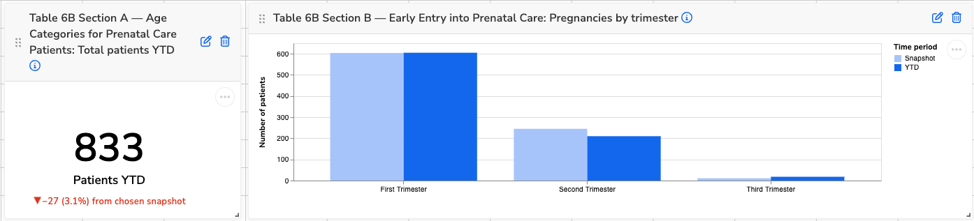
Table 6B Section C–N: Quality of Care Measures
These visuals show compliance and patient counts for each UDS clinical quality measure. Use them to:
- Monitor changes in quality performance over time
- Identify which measures have improving or declining compliance
- Understand shifts in denominator size that may impact rate calculations
- Spot documentation or data entry gaps by comparing numerators to denominators
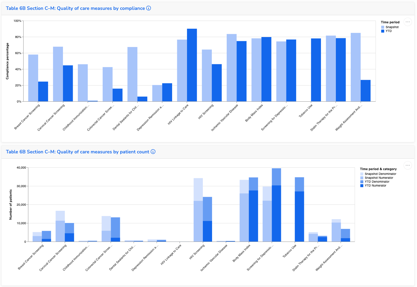
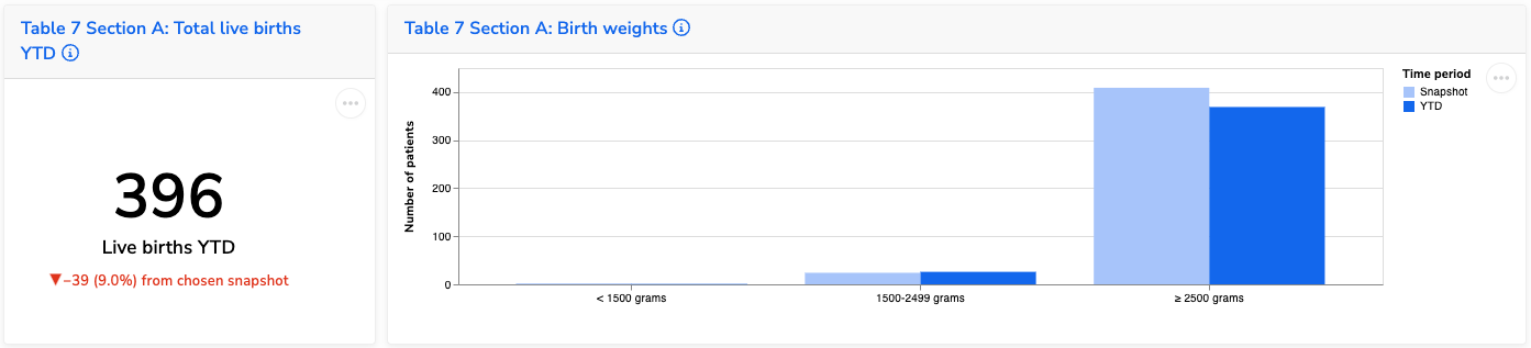
Table 7 Section A: Births and Birth Weights
These visuals show the total number of live births and the distribution of birth weights. Use them to:
- Track trends in total birth volume
- Monitor the proportion of low and normal birth weight deliveries
- Identify shifts that may relate to prenatal care access or maternal health factors