Dashboard best practices and design principles
Over time, the team at Relevant has developed best practices to help create Dashboards that are effective and user friendly.
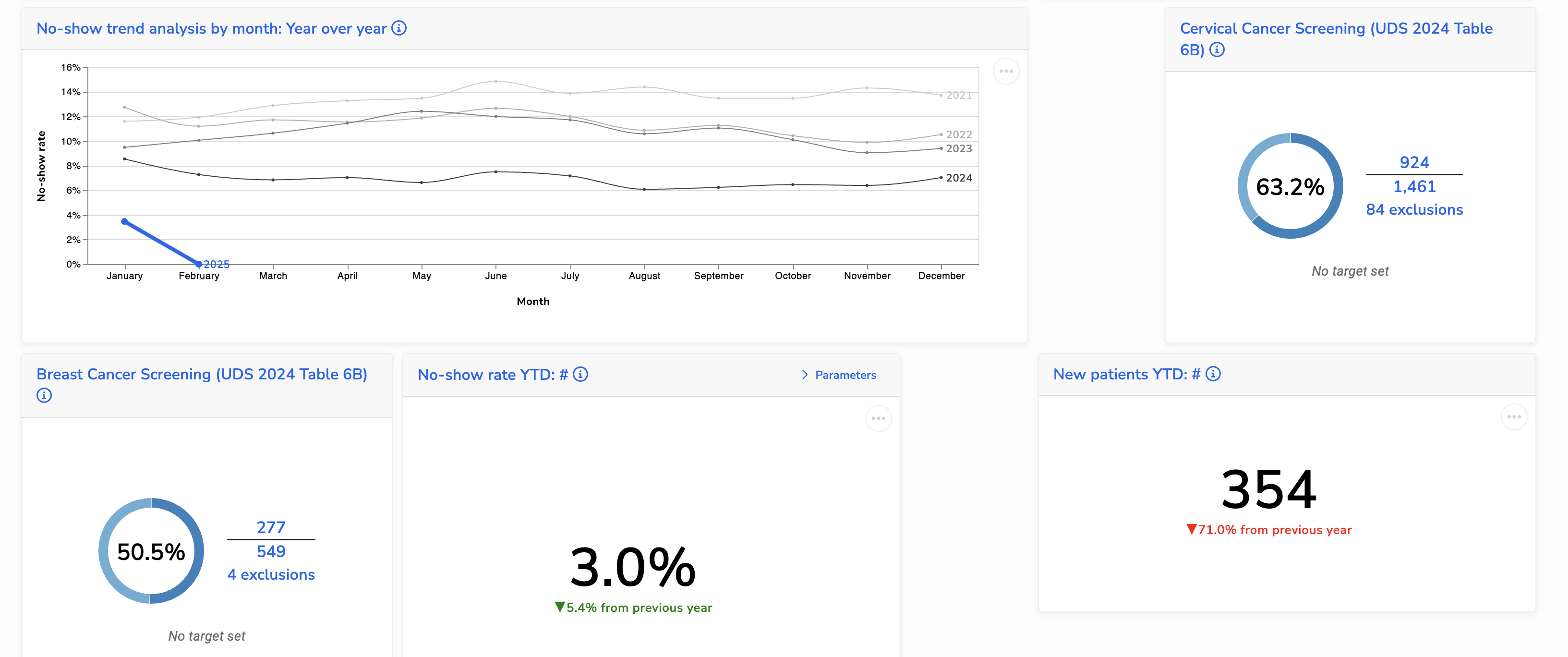
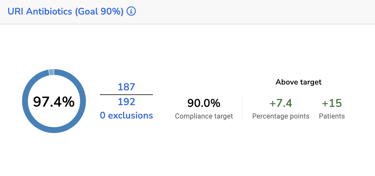
Provide context and benchmarks
Numbers alone don’t always tell the full story. To make your Dashboard insightful, compare data to a relevant benchmark or previous time period. Ask yourself:
- What context helps users quickly interpret the data?
- How does this number compare to a goal, industry standard, or historical average?
- Is this number increasing or decreasing over time?
A good Dashboard should help users understand not just what a number is, but why it matters.
| ✅ Do: Add comparisons to past data or industry benchmarks | ⛔ Don’t: Display raw numbers without context |
 |  |
Create thematic groupings of tiles
Dashboards often include visualizations covering multiple topics. To make them easier to read and navigate, group related tiles together. A well-organized Dashboard helps users quickly find insights without having to search for connections between scattered tiles.
✅ Do: Arrange tiles in logical groups based on topic

⛔ Don’t: Scatter tiles randomly without structure
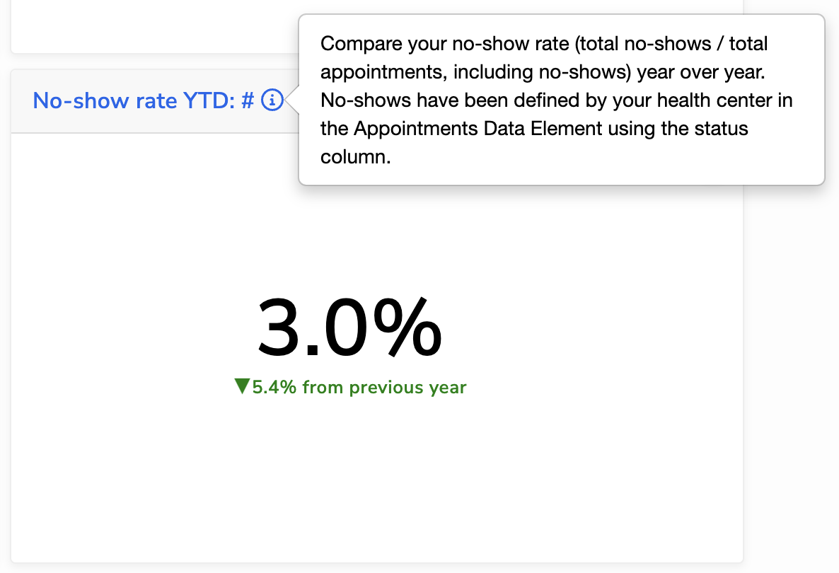
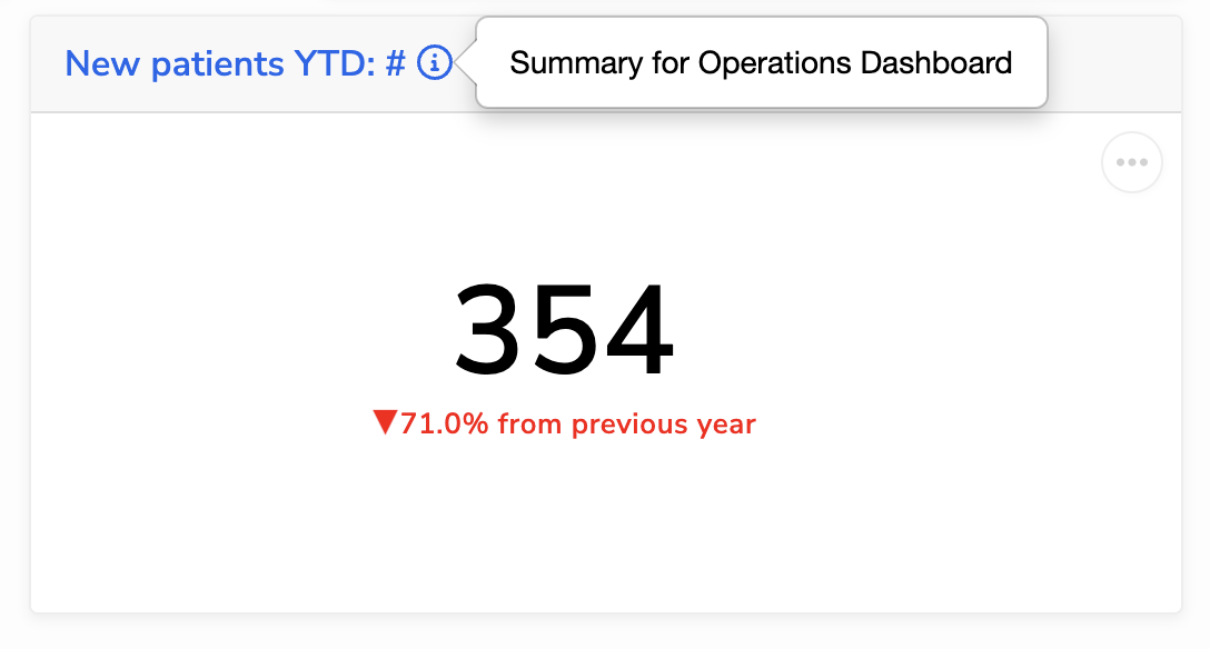
Provide detailed explanations
Dashboards should drive analytical conversation by providing context, explanations, and key takeaways. Don’t miss opportunities to clarify the data, guide interpretations, and highlight potential pitfalls. Use the description fields, which support Markdown, to add this context:
- Dashboard descriptions: use this space to summarize the purpose of the Dashboard
- Tile descriptions: use the Report or Quality Measure description to explain what the data represents, how to read it, and any assumptions or limitations. Pro-tip: link to detailed line-level reports or other Relevant modules for further data exploration.
| ✅ Do: Write clear, informative descriptions that guide interpretation | ⛔ Don’t: Leave descriptions blank or overly vague |
 |  |
Keep visualizations simple
There is a lot of cool stuff you can do with Vega-Lite and Data Grid. We’ve found the best Dashboards keep the visuals clean and easy to interpret:
- Let tile names serve as titles: skip titles in Vega-Lite visuals and use the tile name instead to avoid redundancy.
- Align axes: if you have multiple line charts in the same row or column, keep their axes aligned for easier comparison
- Avoid using Vega-Lite facets: these are difficult to lay out, especially on smaller screens. If possible, use multiple tiles instead.
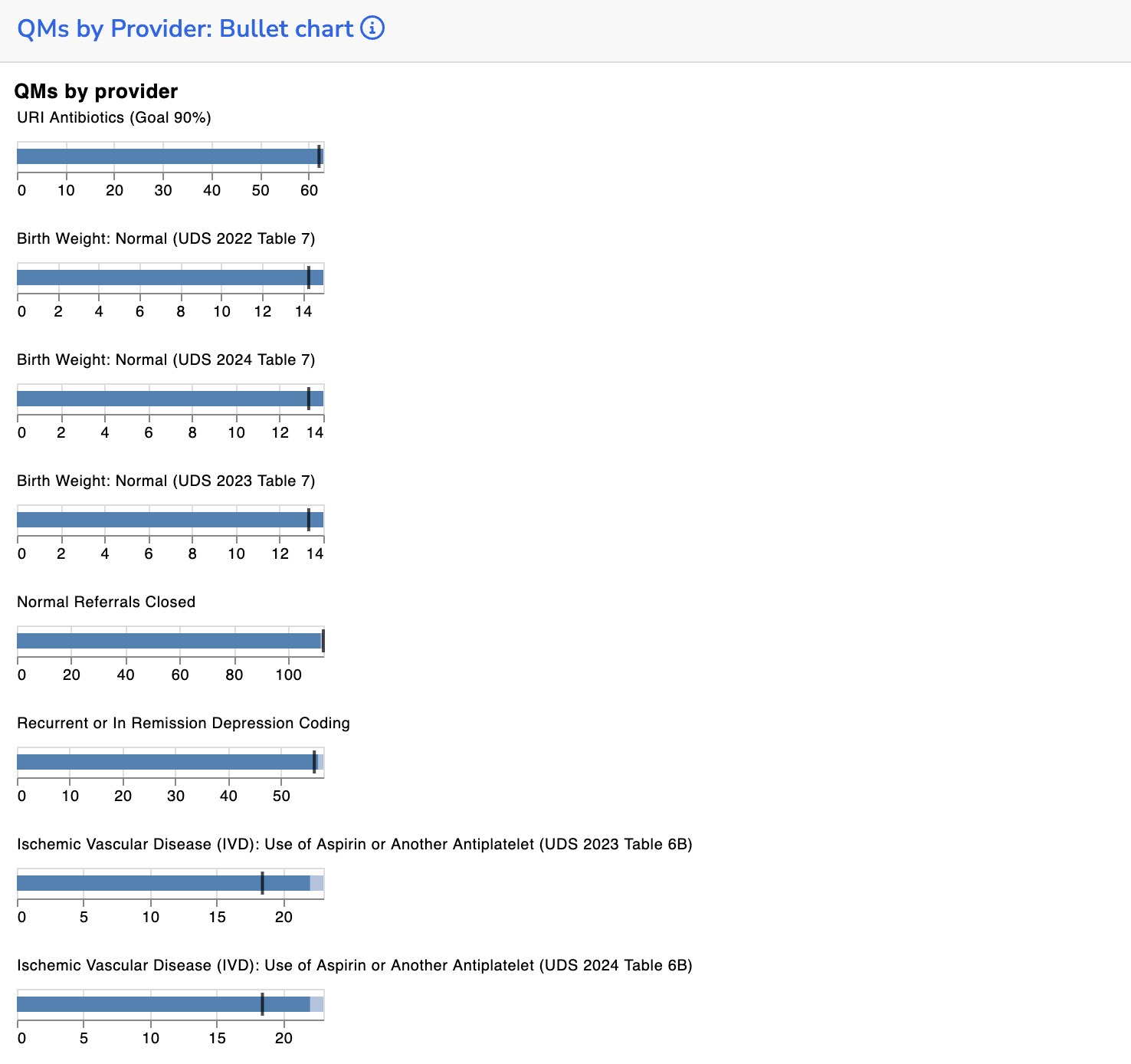
- Use Quality Measure tiles: they’re pre-calculated nightly for better performance, come with cleaner visuals, and include drill-through links for deeper exploration.
✅ Do: Keep charts and visual elements simple and easy to read.
⛔ Don’t: Overcomplicate visuals with unnecessary elements or clutter.
Automate your time periods
Consider the time frame your Dashboard is meant to represent. Instead of relying on users to manually adjust time parameters, automate time period calculations in the underlying SQL (e.g., YTD, MTD) to ensure consistency and reduce friction.
Underlying SQL should be performant
When you add a Report tile to a Dashboard, its SQL runs every time the page loads or the user clicks ‘Run’. If multiple reports tiles are pulling large data sets (e.g., 100K rows), this can slow down performance. To keep dashboards running smoothly:
- Perform data aggregation in SQL rather than in the Data Grid filters or Vega-Lite specs
- If you are doing complex calculations, consider moving them into the pipeline so they are pre-computed overnight. Depending on what data you need, the right place may be a transformer, measure, or custom alert.